Special Section
How to use color creatively in photography!
Guide to better photography
Seven tips on using color creatively
To draw the viewer’s attention to the center of interest or sharply separate forms, the color photographer utilizes visual devices defined in the black-and-white counterpart.
Some of this allows for juxtaposition like blue and orange or yellow and violet.

A scene does not need to contain bright raw colors in order to make a good picture. In fact, the more subtle sophisticated hues often produce the most pleasing results. An interesting example is featured with this American guitarist singing inside of a café.
Sometimes areas of bright color can be sharply emphasized by setting them off against larger areas of white or black. In this photo you can see the silhouette of a crowd against a sharp white background of a gallery.
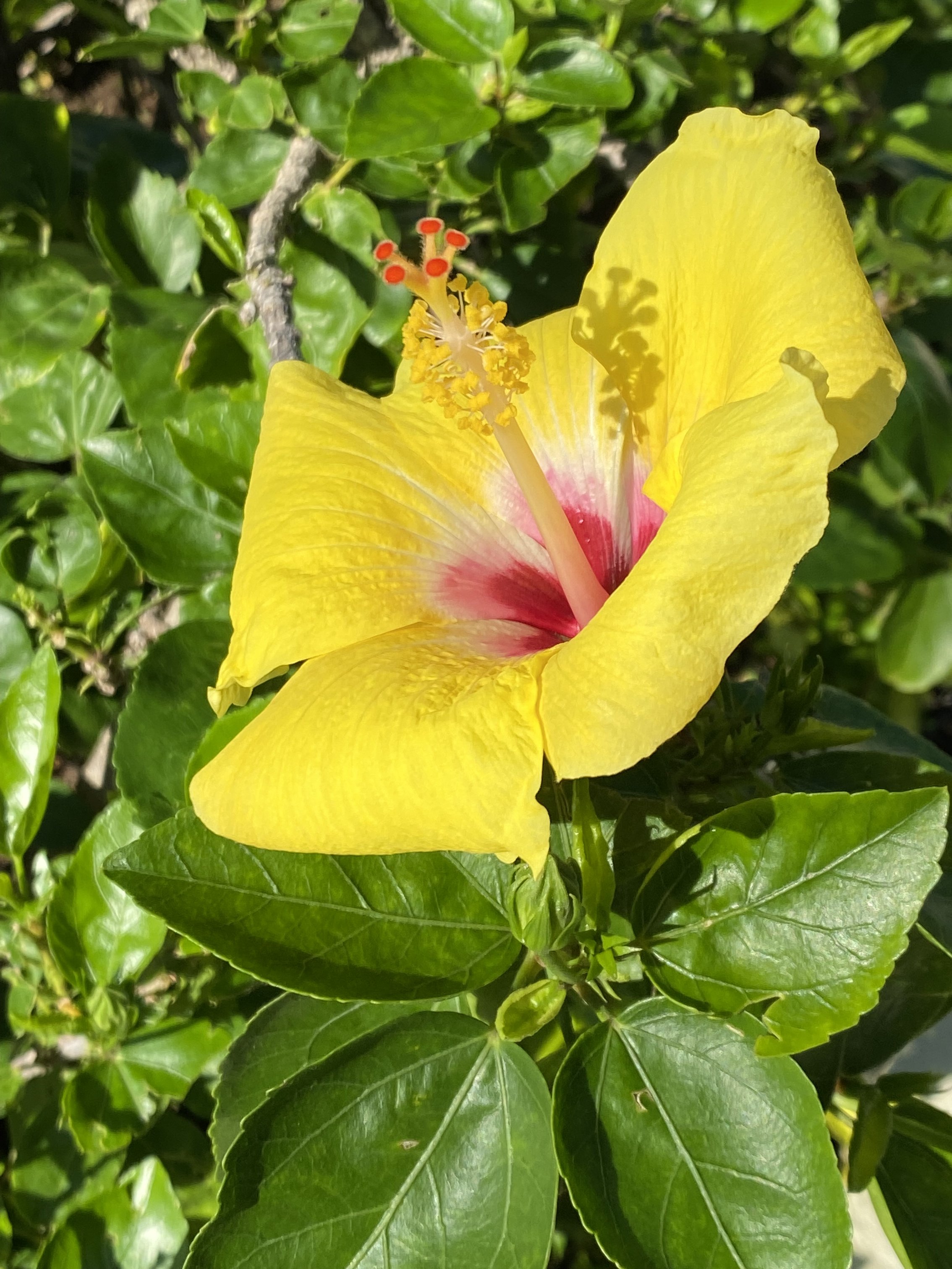
Another method of utilizing color composition is illustrated here with a yellow flower, a single area, a prominent, vibrant color. The yellow is juxtaposed against the monochromatic green, thereby unifying the composition. This technique proves beneficial for incorporating color into an image without resulting in the patchy effect caused by an excessive number of competing hues.
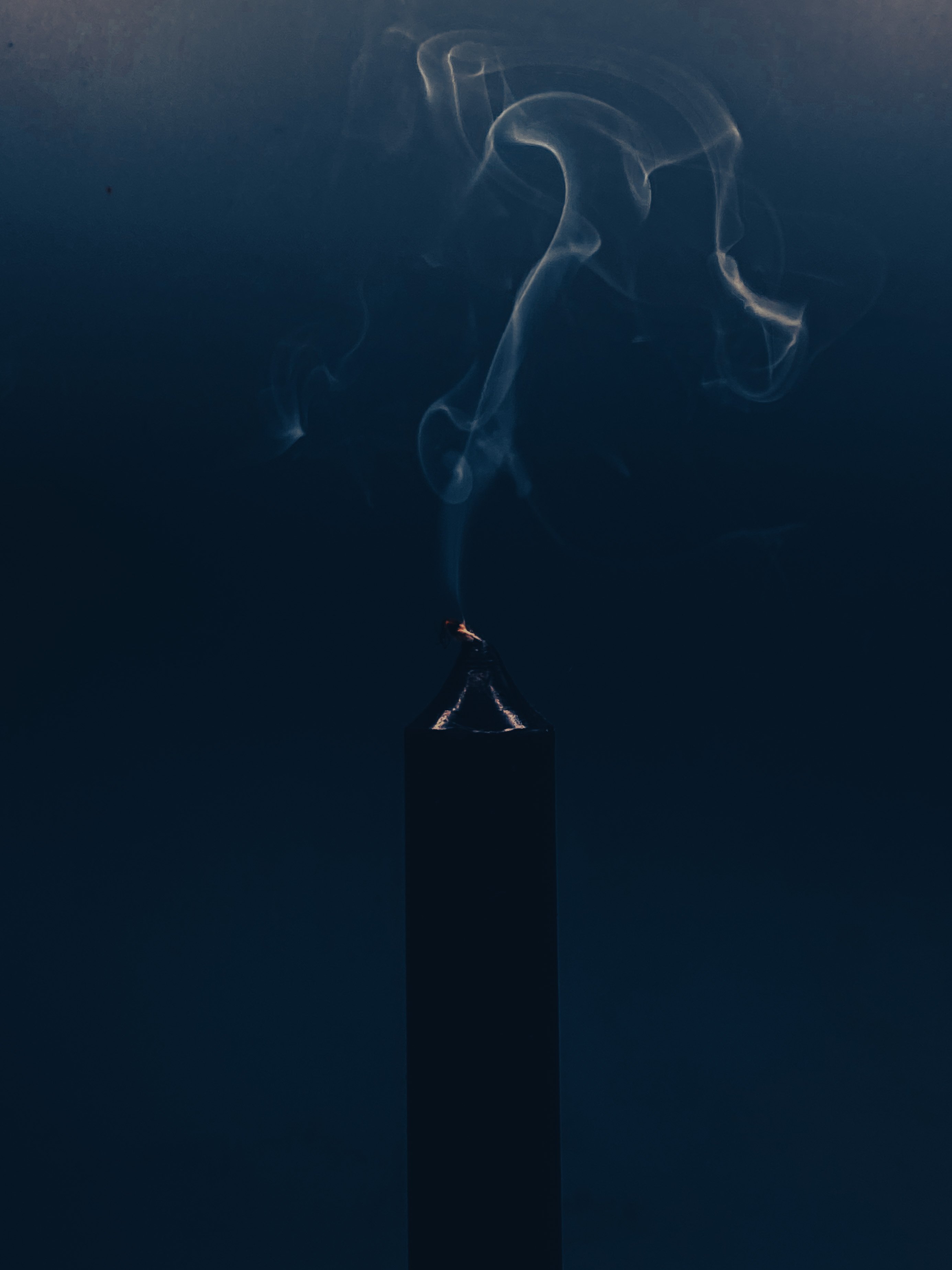
It is possible to record color subjectively as it strikes the inner eye of the photographer, rather than as it actually exists in nature, the rich smoky hue enhanced with lighting effects to further enrich the viewing experience.
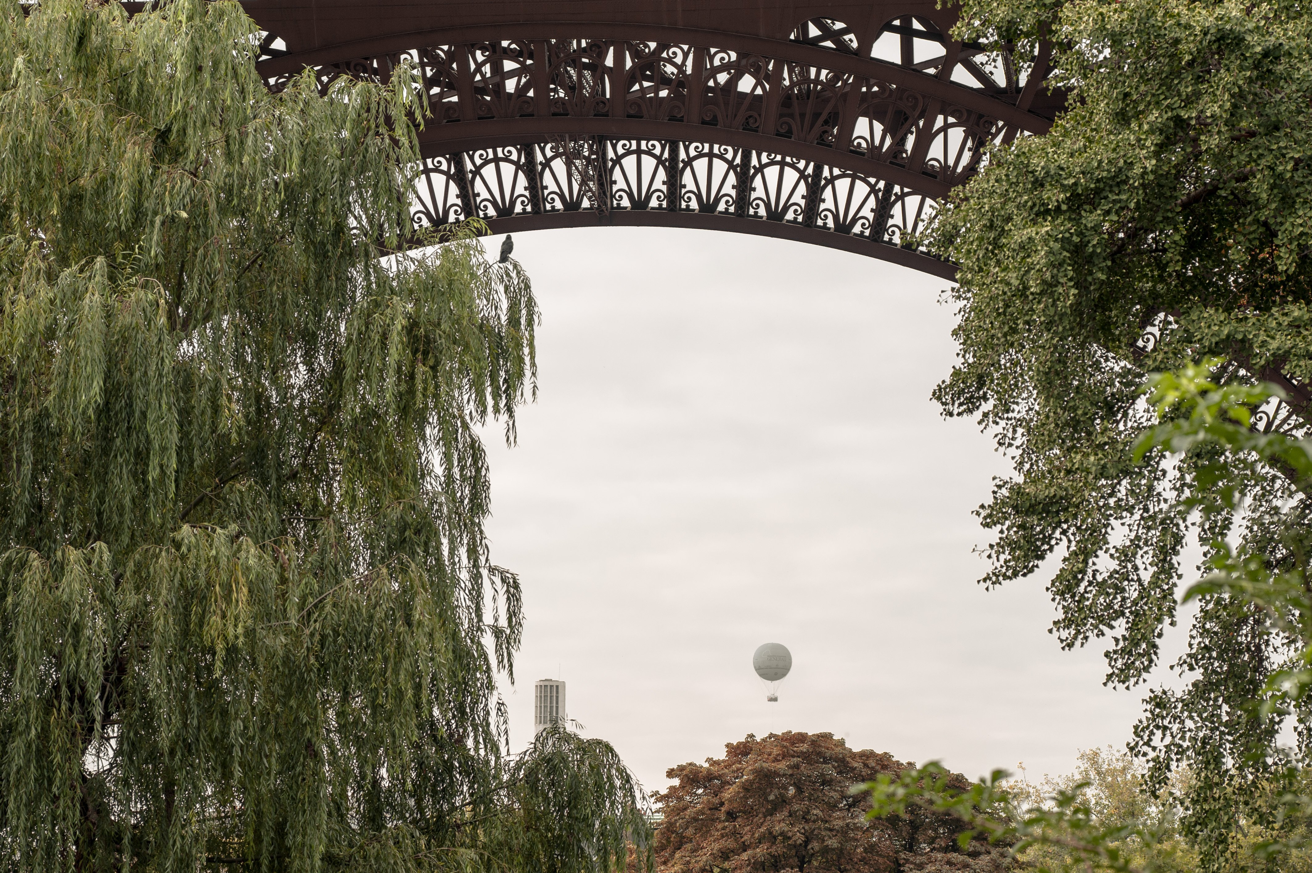
Paradoxically enough, the most satisfying color pictures are sometimes those which contain a minimum of color variance. Featured here a Hot air balloon under the Eiffel Tower
A color photograph can be more than a literal imitation of reality